The first impression is the last impression. Whenever a user visits a website, the first thing he/she notices is the website’s design. A company’s credibility depends on a website’s design since it forms a company’s impression in the users’ mind. In fact, 94% impressions are based explicitly on a site’s design. This makes it extremely important to follow the best website design practices which can directly impact conversions. You not only require a beautifully designed website but also a site that can convert visitors into leads.
Rule #1 Branding Must be Consistent
Some marketers take branding non-seriously by not being fully aware of its impact. Branding is one of the cornerstones of a website since it impacts conversions. One good example is of Apple inc that has mastered the art of branding. From the logo to all the other web elements, everything is a representation of its company values. Some points which you will immediately notice by visiting the homepage include:
- The distinctive logo that captures users-attention.
- Stylish product image
- Headline and Subheading for conveying brand goals
In short, a brand must indicate your company’s story. Make sure your website represents the right story, but to fulfill that, you must have a clear idea of the story you want your users to know. Focus on brand values, ideas, and target audience.
Rule #2 Include a Well Designed Blog
Having an active blog is also another important feature of a successful website. Agencies which maintain a blog enjoys 126% more growth in leads than businesses which pay little to no value in publishing content. The active blog also signals search engines about your website, thus building authority for both search engines and users. Last but not the least, it also helps web pages to be crawled and indexed by the search engines.
Rule #3 Keep Company News off Your Homepage
Keeping audience informed about the company and its public matters builds trust and credibility in the eyes of users. But at the same time, it becomes very promotional. Even though a blog publishes informative content etc to drive user traffic to a website, company news does not answer visitor’s question. This is why you should not keep company news on the home page. Users learn enough from the website design and content, they must not be forced into reading company news as it can drive them away from your website and thus conversion.
Rule #4 Respect Users’ Patience
People are always in a rush when it’s about surfing websites. Even a 1% delay in page loading time reduces conversions, according to a research done by the Aberdeen Group. This means that every second count as far as a page loading speed is concerned. Fortunately, there are a handful of tools available for troubleshooting website speed issues:
- Google PageSpeed Insights
- Pingdom
- GTmetrix
- KeyCDN
- Sucuri
Rule #5 Don’t Over Crowd Your Website
If something is looking out of place, then it really is out of place and must not be added to your homepage design. Adding more stuff is not always the right way to go. You are not experimenting with your homepage by throwing stuff to see what looks good and what doesn’t. Homepage must only have elements that are important. But, it does not mean that a homepage has to eliminate important sections. Make sure it does not include areas which need detailed explanation as those sections are for inner pages.
Rule #6 Create a Clear Navigation
A clear navigation is one of the most critical web elements. If a user is unable to navigate properly on a site, then it will reduce your conversions. Navigation is mostly found on the left or top position of a website. Make sure you follow this standard location or it will cause users to leave your site without conversion.
Also, put all the important pages in the website navigation instead of hiding them in the dropdowns. Adding more options also creates confusions for users. You may have seen big names with dropdowns but they usually get away due to their big brand name. If you are looking to make a name for yourself in the market, then make your site as simple to navigate as possible.
Rule #7 Improve Readability
Website content must be written in a readable format with proper grammar, headings and without any slang. Paragraphs must be short, easy to read and understand. That’s because long paragraphs are difficult to read on a computer screen and turn away many visitors.
A good homepage design avoids long content and always includes short sections based on services, products etc. to keep the visitors interested. This helps users to navigate their way around a homepage while reading and getting an overview of your company’s services.
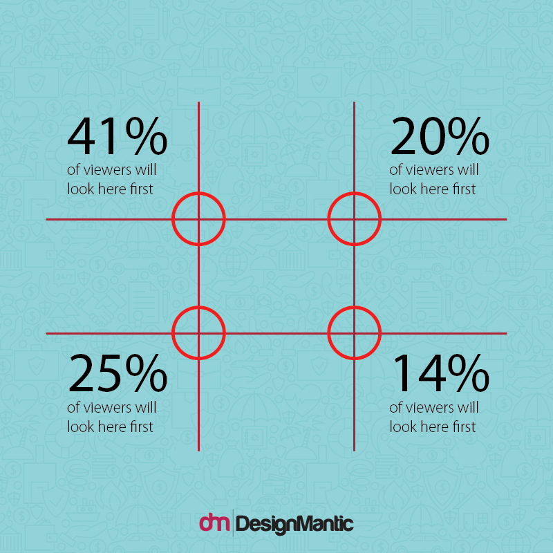
Rule #8 Rule of Thirds
Rule of thirds is famous in the field of fine arts and photography, but it has also made its way into website design. This means that whenever, you are to design a site, use an overlay with 2 horizontal and vertical evenly spaced lines. The highlighted dots are the areas which naturally get user attention. You can place your CTAs and other important web elements in that area. However, make sure there is consistency and design flow around those elements.
Conclusion
Creating a perfect homepage for increased business conversions is not easy but is important at the same time. Bottom line what you want your users to do when they visit a website will help you create the brand image through your homepage design that you want. In short, knowing your audience and what they are looking for by placing yourself in their shoes will create a good page homepage design to increase conversion rate.
Faiza Farooqi
Faiza Farooqi is an Ecommerce Manager at Codup who accepts challenging strategies and puts amazing ideas on the table! She is an active community manager and also blogs at Codup Readers.